Colleges
- AAC
- ACC
- Big 12
- Big East
- Big Ten
- Pac-12
- SEC
- Atlantic 10
- Conference USA
- Independents
- Junior College
- Mountain West
- Sun Belt
- MAC
- More
- Navy
- UAB
- Tulsa
- UTSA
- Charlotte
- Florida Atlantic
- Temple
- Rice
- East Carolina
- USF
- SMU
- North Texas
- Tulane
- Memphis
- Miami
- Louisville
- Virginia
- Syracuse
- Wake Forest
- Duke
- Boston College
- Virginia Tech
- Georgia Tech
- Pittsburgh
- North Carolina
- North Carolina State
- Clemson
- Florida State
- Cincinnati
- BYU
- Houston
- Iowa State
- Kansas State
- Kansas
- Texas
- Oklahoma State
- TCU
- Texas Tech
- Baylor
- Oklahoma
- UCF
- West Virginia
- Wisconsin
- Penn State
- Ohio State
- Purdue
- Minnesota
- Iowa
- Nebraska
- Illinois
- Indiana
- Rutgers
- Michigan State
- Maryland
- Michigan
- Northwestern
- Arizona State
- Oregon State
- UCLA
- Colorado
- Stanford
- Oregon
- Arizona
- California
- Washington
- USC
- Utah
- Washington State
- Texas A&M
- Auburn
- Mississippi State
- Kentucky
- South Carolina
- Arkansas
- Florida
- Missouri
- Ole Miss
- Alabama
- LSU
- Georgia
- Vanderbilt
- Tennessee
- Louisiana Tech
- New Mexico State
- Middle Tennessee
- Western Kentucky
- UTEP
- Florida International University
High School
- West
- Midwest
- Northeast
- Southeast
- Other
- Alaska
- Arizona
- California
- Colorado
- Nevada
- New Mexico
- Northern California
- Oregon
- Southern California Preps
- Washington
- Edgy Tim
- Indiana
- Kansas
- Nebraska
- Iowa
- Michigan
- Minnesota
- Missouri
- Oklahoma Varsity
- Texas Basketball
- Texas
- Wisconsin
- Delaware
- Maryland
- New Jersey Basketball
- New Jersey
- New York City Basketball
- Ohio
- Pennsylvania
- Greater Cincinnati
- Virginia
- West Virginia Preps
ADVERTISEMENT
Install the app
How to install the app on iOS
Follow along with the video below to see how to install our site as a web app on your home screen.
Note: This feature may not be available in some browsers.
You are using an out of date browser. It may not display this or other websites correctly.
You should upgrade or use an alternative browser.
You should upgrade or use an alternative browser.
Iowa's new uniforms | Adidas version
- Thread starter PHXIowaClub
- Start date
I think we can do better. Not impressed. Looks like a couple of jr. High kids had a 1/2 hr. With nothing to do and through that together...
I think I saw that picture about a year ago under some alternative uniform ditty on a sports site somewhere. It showed teams in opposing team colors. If you notice, it has a big gold (red) N on it. Actually, I kind of like it.
Another ugly atrocity. Tired of everybody screwing with uniforms. You can count on one finger the ones that have been acceptable. Schools have colors. Schools have tradition. Combine the two and you have a uniform. Move on.
I think we can do better. Not impressed. Looks like a couple of jr. High kids had a 1/2 hr. With nothing to do and through that together...
We can't do better. Remember Purdue a couple years ago... gag
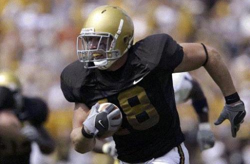
Iowa fans on this board have been punked. Look at the field. The uniform design is Nebraska's. It's Tommy Armstrong. The uniform and N logo have been colorized (red to black, white to yellow).
I tried explaining that to them earlier, as well as a couple others... The what would your rivals look like in your teams color scheme. They must not have seen the red and yellow (ISU) Iowa uniforms.
I think it's Ameer Abdullah, but yes those are Nebraska unis.Iowa fans on this board have been punked. Look at the field. The uniform design is Nebraska's. It's Tommy Armstrong. The uniform and N logo have been colorized (red to black, white to yellow).
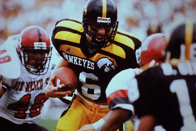
I wouldn't mind Iowa using the throwbacks we wore against Ball State in 2010. Those were the late 50s/Evy era uniforms, similar to the pic above. I don't see why we couldn't do that once a year like Notre Dame and their green jerseys etc etc.
Those unis are simple, but still unique to Iowa and look good without trying to do too much.
Those unis are simple, but still unique to Iowa and look good without trying to do too much.
Those unis are simple, but still unique to Iowa and look good without trying to do too much.[/QUOTE]
Kind of like the offense; simple, unique and not trying to do too much...
Kind of like the offense; simple, unique and not trying to do too much...
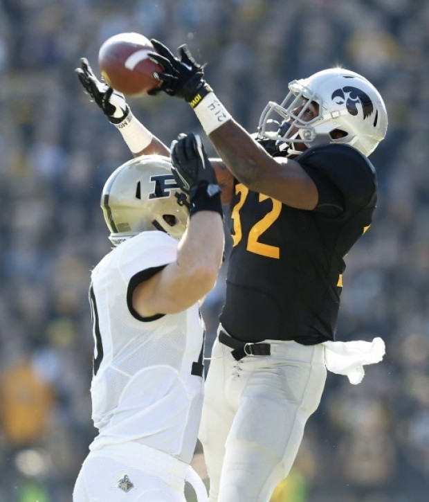
i can't stand those uni's they wore against purdue. The only 2 throwbacks that looked good in my opinion were the 2010 throwbacks against Ball State and the 2005 throwbacks against Kent State.


Obviously when I saw the pic the other day this was fake. After all, from the subject line alone why would Adidas have anything to do with anything Iowa related. Not sure if the OP was just new to Photoshop ... anywho ... I do think with Iowa's black and gold scheme there are a lot of cool variations Nike could come up with. Not saying we have to become an Oregon, but the players like that sort of thing and for fans it is fun as well ...
Those unis are simple, but still unique to Iowa and look good without trying to do too much.
Kind of like the offense; simple, unique and not trying to do too much...
Simple...maybe. Not trying to do too much.....depends on which fans you ask given their specific complaint.
Unique? If we actually still operate out of the pro style (believe it's changed under Greg Davis....or he's tried to), there are still a ton of teams that run variations of the pro style/power-I/one-back set.
Iowa's offense ain't one of a kind. We just aren't very creative in the manner in which plays are called.
I thought these were the ugliest uniforms I'd ever seen, at the time. They still rank right up there. From the stands they made Iowa look like a flock of scrawny chickens.
[/
I thought these were the ugliest uniforms I'd ever seen, at the time. They still rank right up there. From the stands they made Iowa look like a flock of scrawny chickens.
We do need the gold helmets once in a while at the very least. Why not a gold version of our current helmet with a black tigerhawk? Why would that not look good?
I have no idea how they made a jersey that flipping ugly. If the jersey was not so damn hideous then maybe the uniform would not have been terrible.I liked the uniforms we wore against Purdue in 2012...I'd love to see them again

Similar threads
The Kim Mulkey Washington Post article came out 2 hours before LSU & UCLA tipped off in the Sweet 16
- Replies
- 43
- Views
- 5K
- Replies
- 3
- Views
- 231
ADVERTISEMENT
ADVERTISEMENT


