Colleges
- AAC
- ACC
- Big 12
- Big East
- Big Ten
- Pac-12
- SEC
- Atlantic 10
- Conference USA
- Independents
- Junior College
- Mountain West
- Sun Belt
- MAC
- More
- Navy
- UAB
- Tulsa
- UTSA
- Charlotte
- Florida Atlantic
- Temple
- Rice
- East Carolina
- USF
- SMU
- North Texas
- Tulane
- Memphis
- Miami
- Louisville
- Virginia
- Syracuse
- Wake Forest
- Duke
- Boston College
- Virginia Tech
- Georgia Tech
- Pittsburgh
- North Carolina
- North Carolina State
- Clemson
- Florida State
- Cincinnati
- BYU
- Houston
- Iowa State
- Kansas State
- Kansas
- Texas
- Oklahoma State
- TCU
- Texas Tech
- Baylor
- Oklahoma
- UCF
- West Virginia
- Wisconsin
- Penn State
- Ohio State
- Purdue
- Minnesota
- Iowa
- Nebraska
- Illinois
- Indiana
- Rutgers
- Michigan State
- Maryland
- Michigan
- Northwestern
- Arizona State
- Oregon State
- UCLA
- Colorado
- Stanford
- Oregon
- Arizona
- California
- Washington
- USC
- Utah
- Washington State
- Texas A&M
- Auburn
- Mississippi State
- Kentucky
- South Carolina
- Arkansas
- Florida
- Missouri
- Ole Miss
- Alabama
- LSU
- Georgia
- Vanderbilt
- Tennessee
- Louisiana Tech
- New Mexico State
- Middle Tennessee
- Western Kentucky
- UTEP
- Florida International University
High School
- West
- Midwest
- Northeast
- Southeast
- Other
- Alaska
- Arizona
- California
- Colorado
- Nevada
- New Mexico
- Northern California
- Oregon
- Southern California Preps
- Washington
- Edgy Tim
- Indiana
- Kansas
- Nebraska
- Iowa
- Michigan
- Minnesota
- Missouri
- Oklahoma Varsity
- Texas Basketball
- Texas
- Wisconsin
- Delaware
- Maryland
- New Jersey Basketball
- New Jersey
- New York City Basketball
- Ohio
- Pennsylvania
- Greater Cincinnati
- Virginia
- West Virginia Preps
ADVERTISEMENT
Install the app
How to install the app on iOS
Follow along with the video below to see how to install our site as a web app on your home screen.
Note: This feature may not be available in some browsers.
You are using an out of date browser. It may not display this or other websites correctly.
You should upgrade or use an alternative browser.
You should upgrade or use an alternative browser.
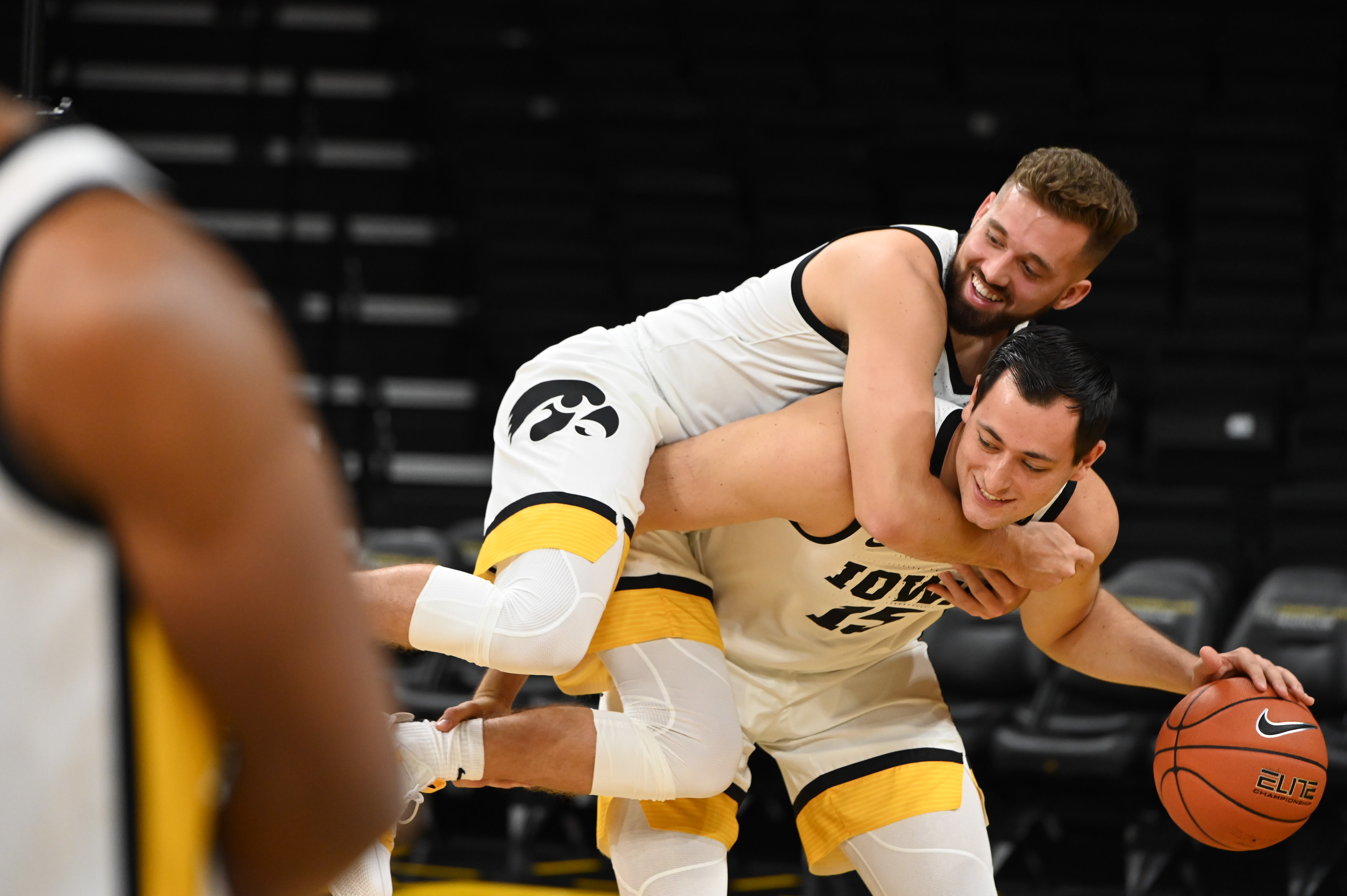
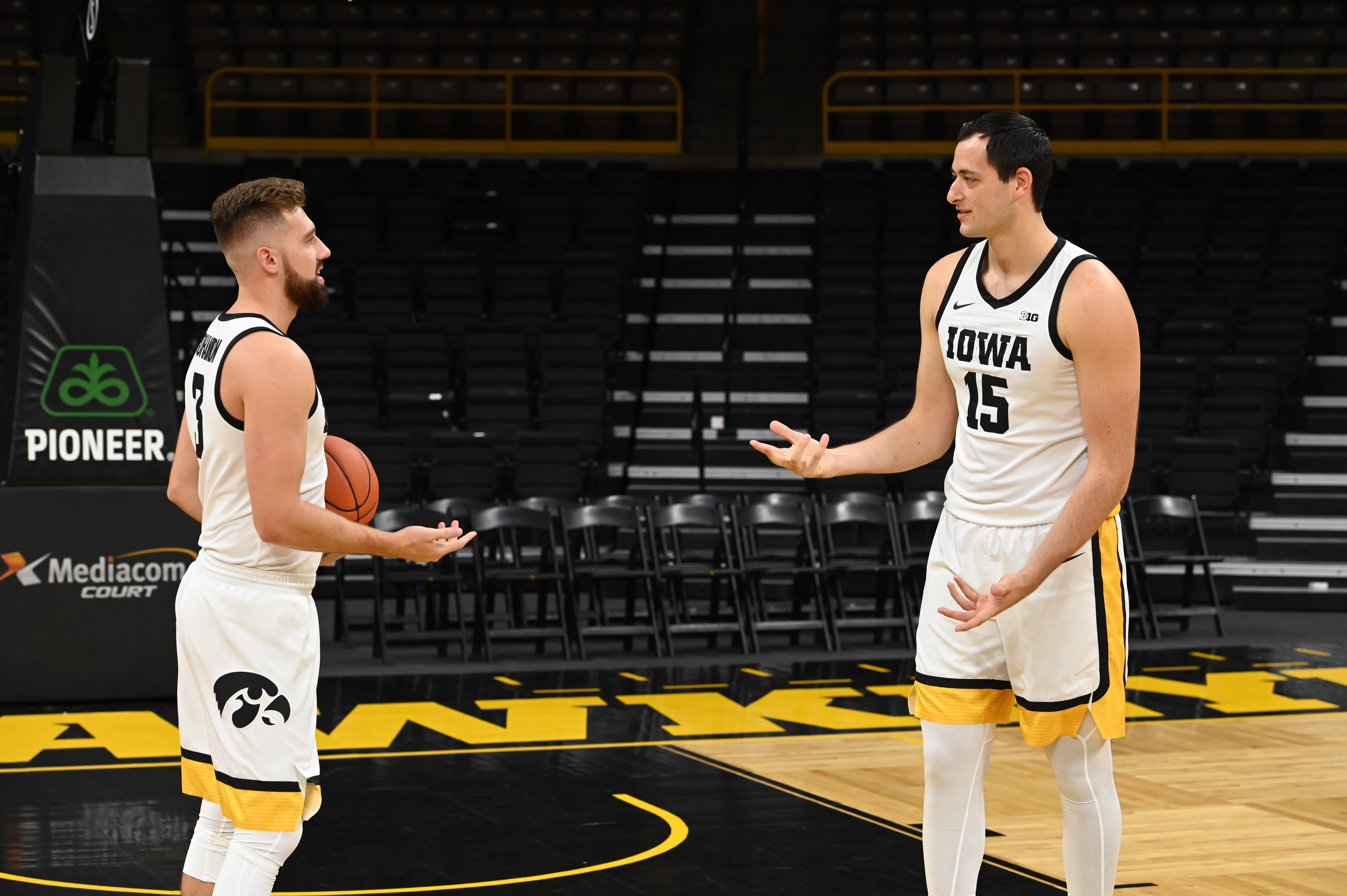
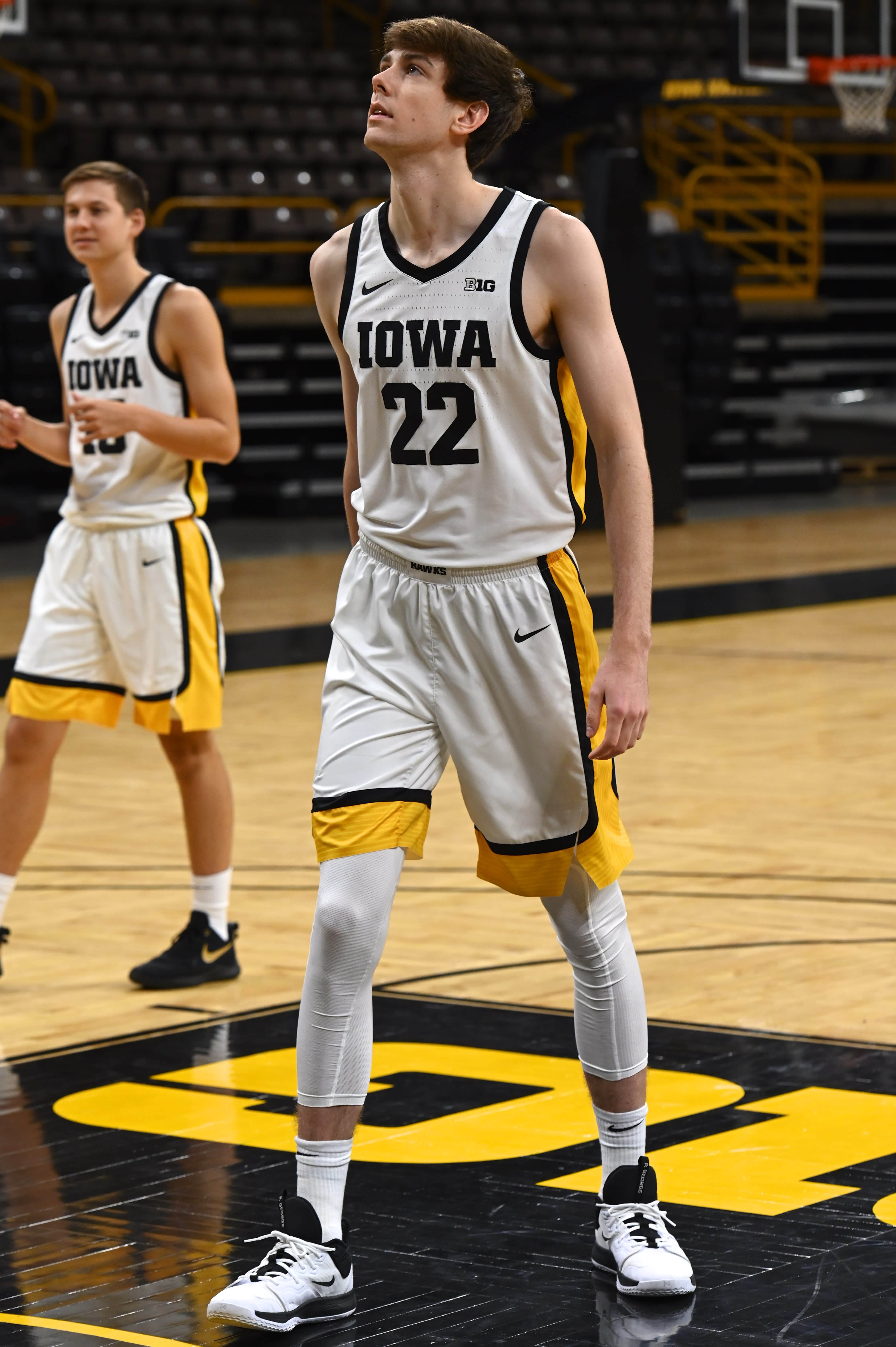
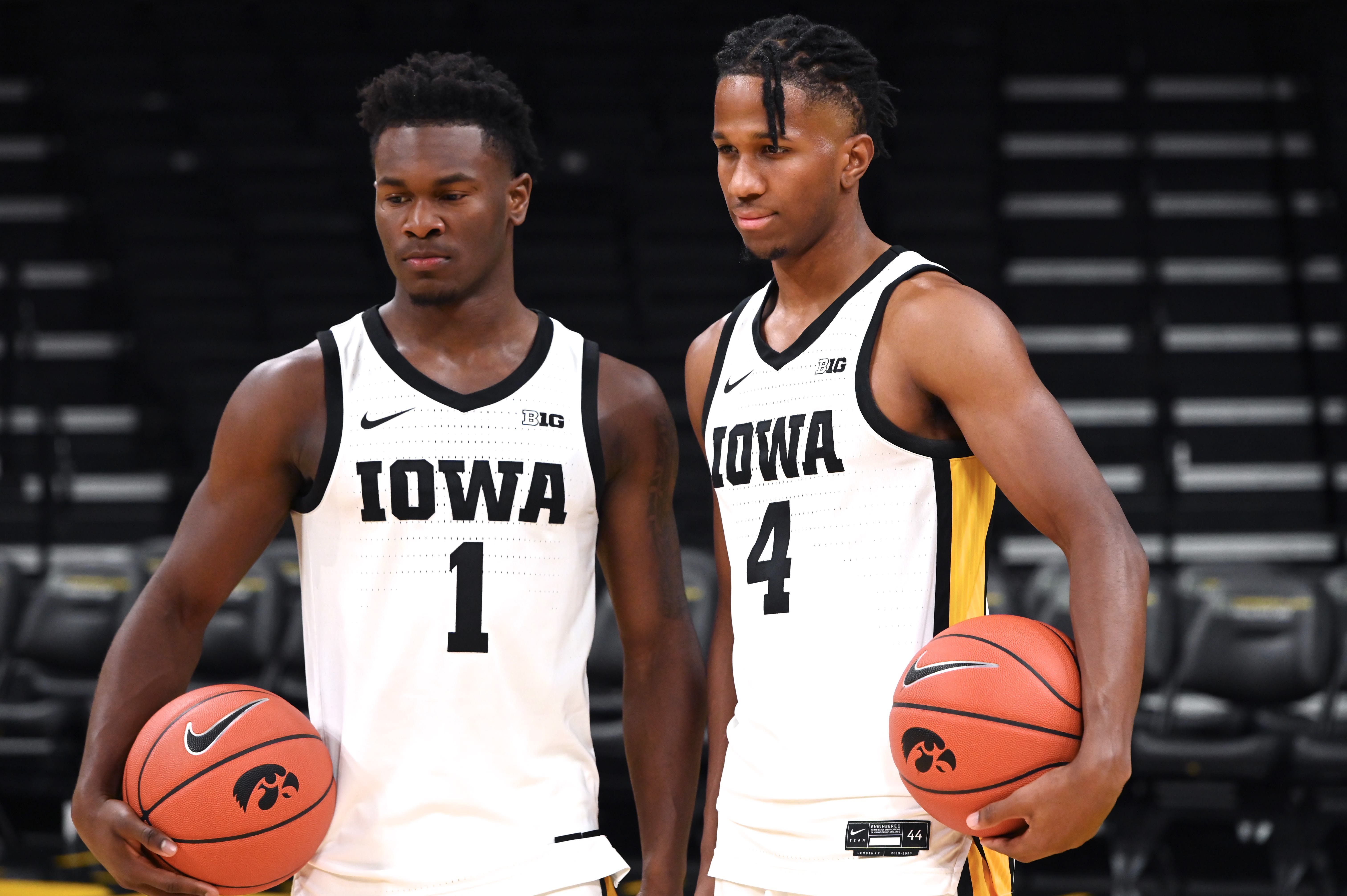
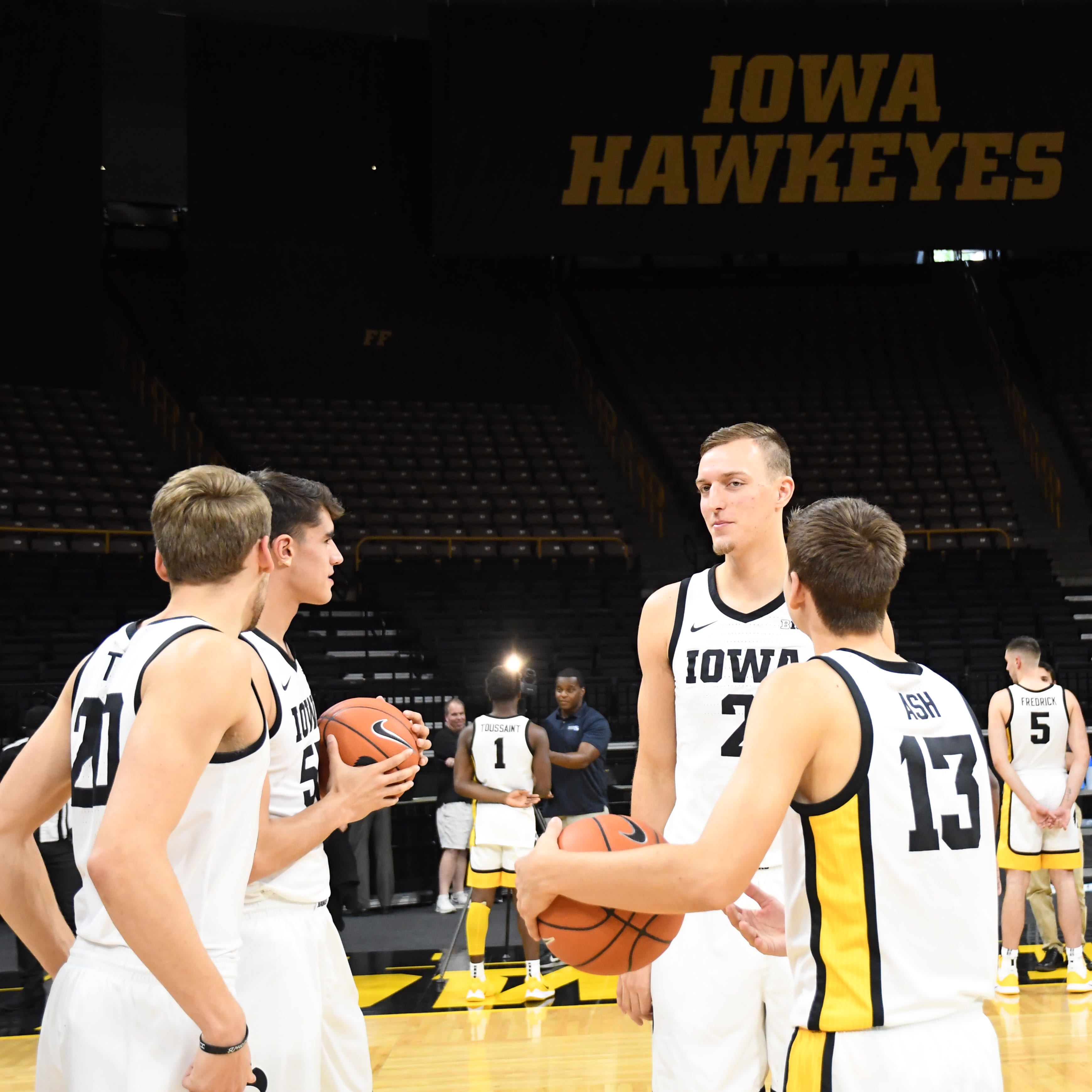
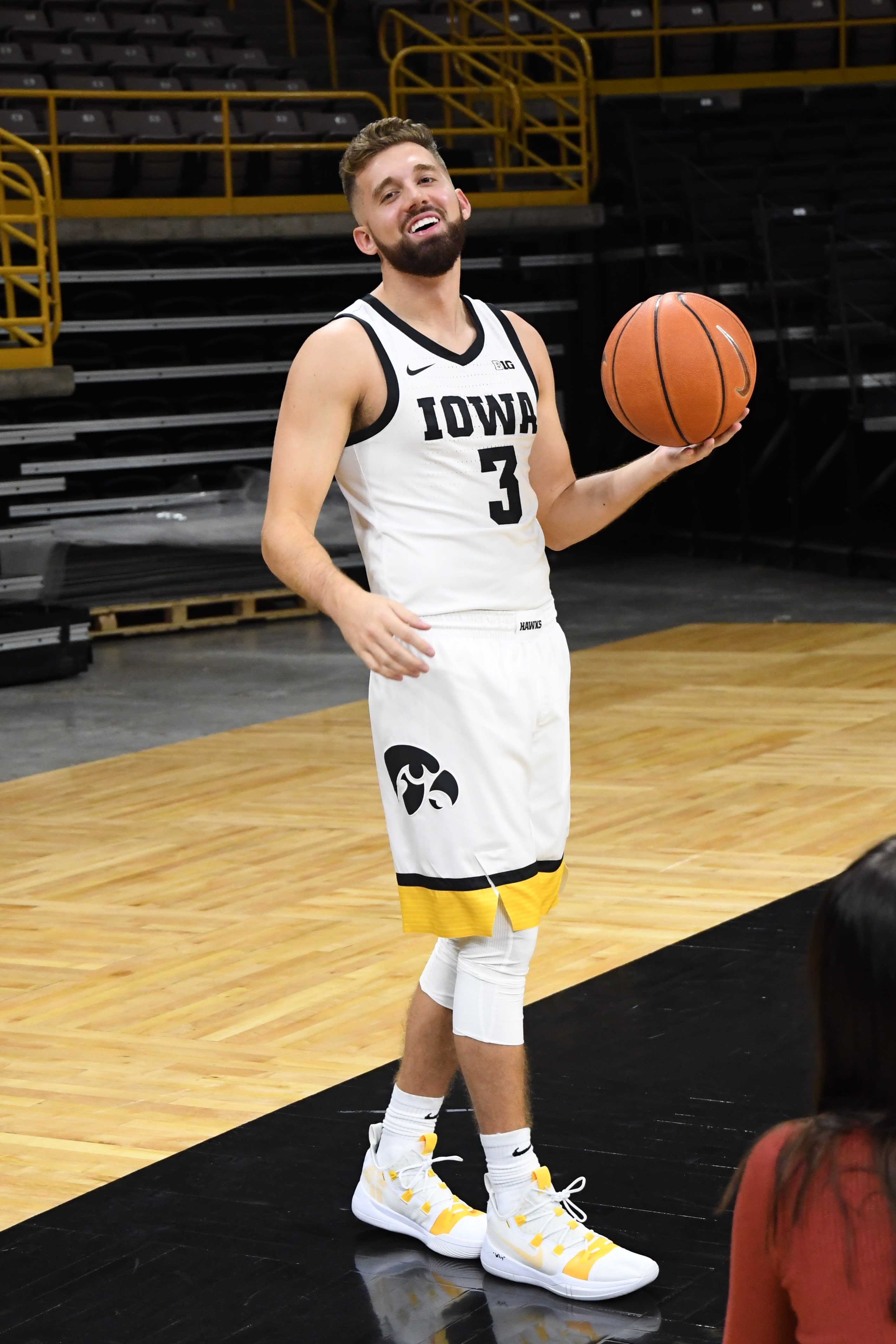
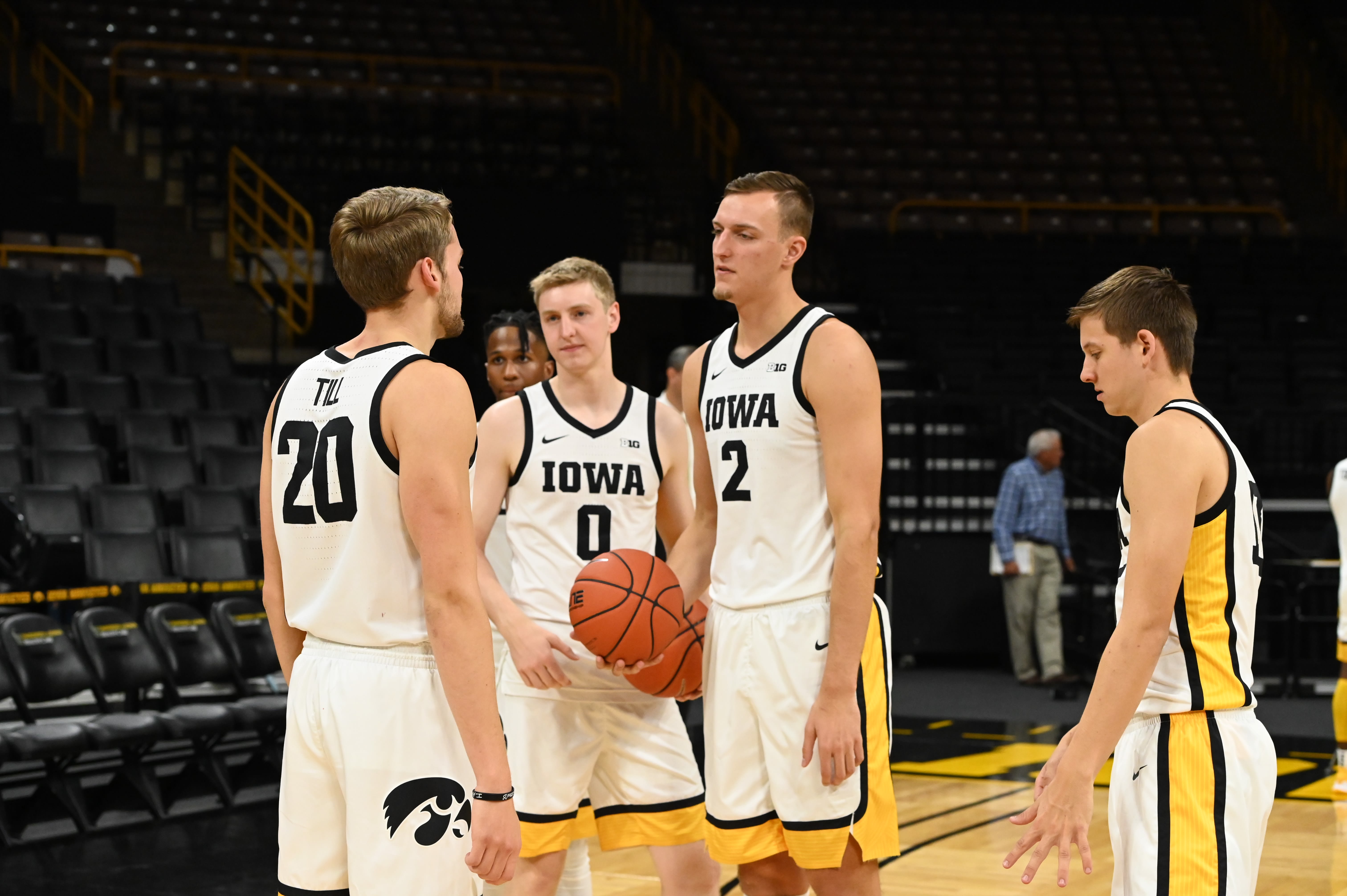
new jerseys
- Thread starter QChawks
- Start date
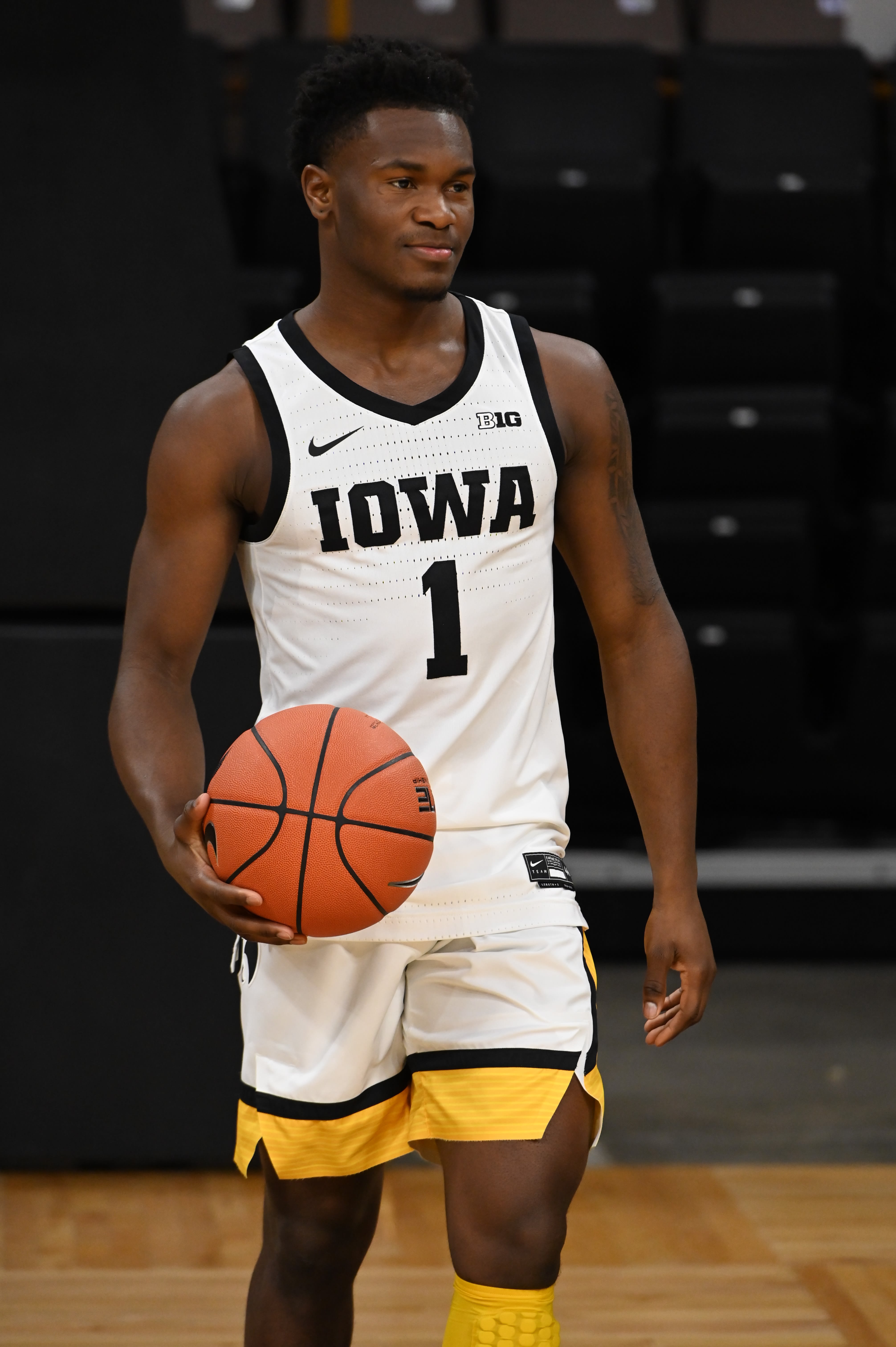
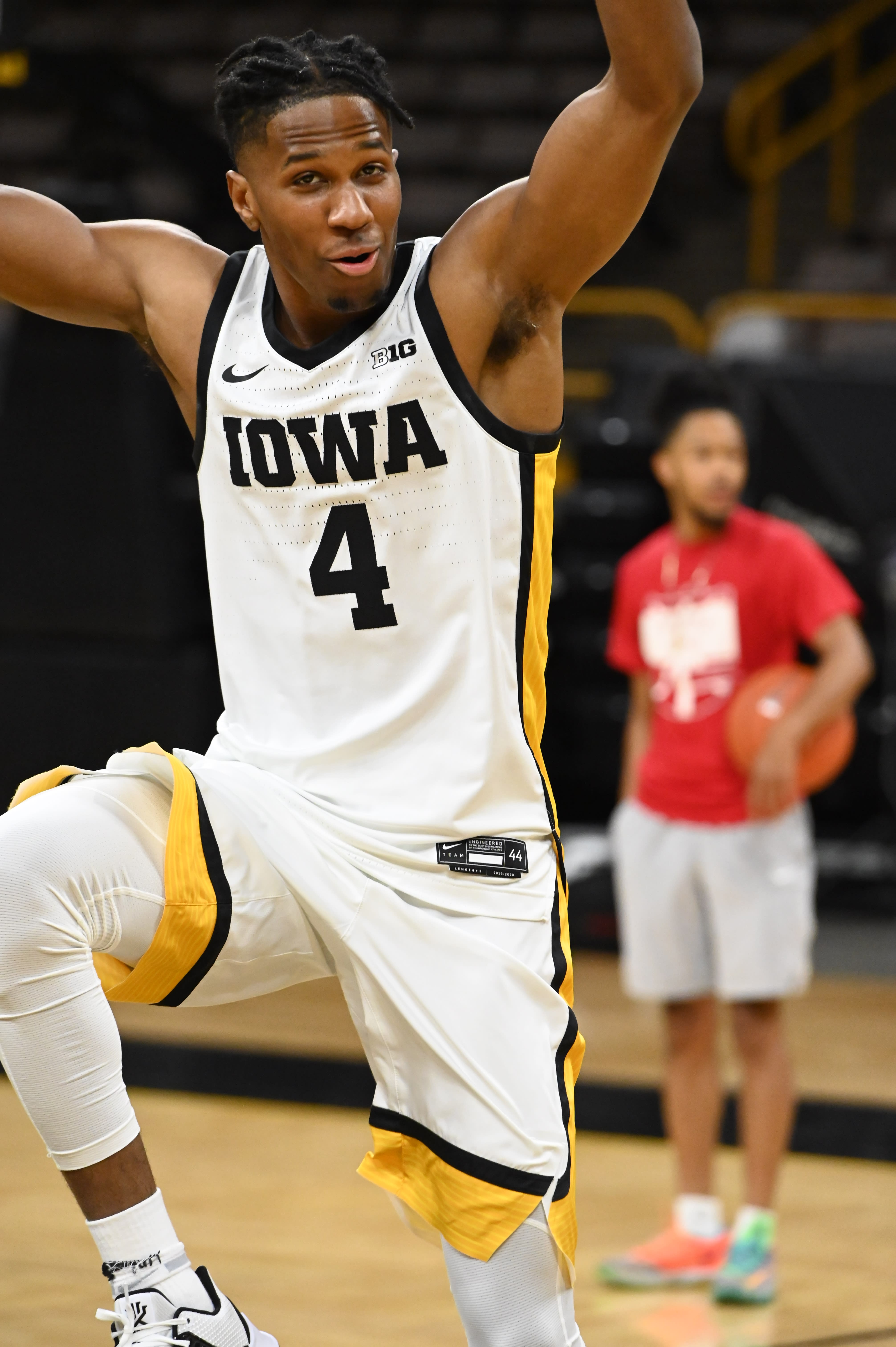
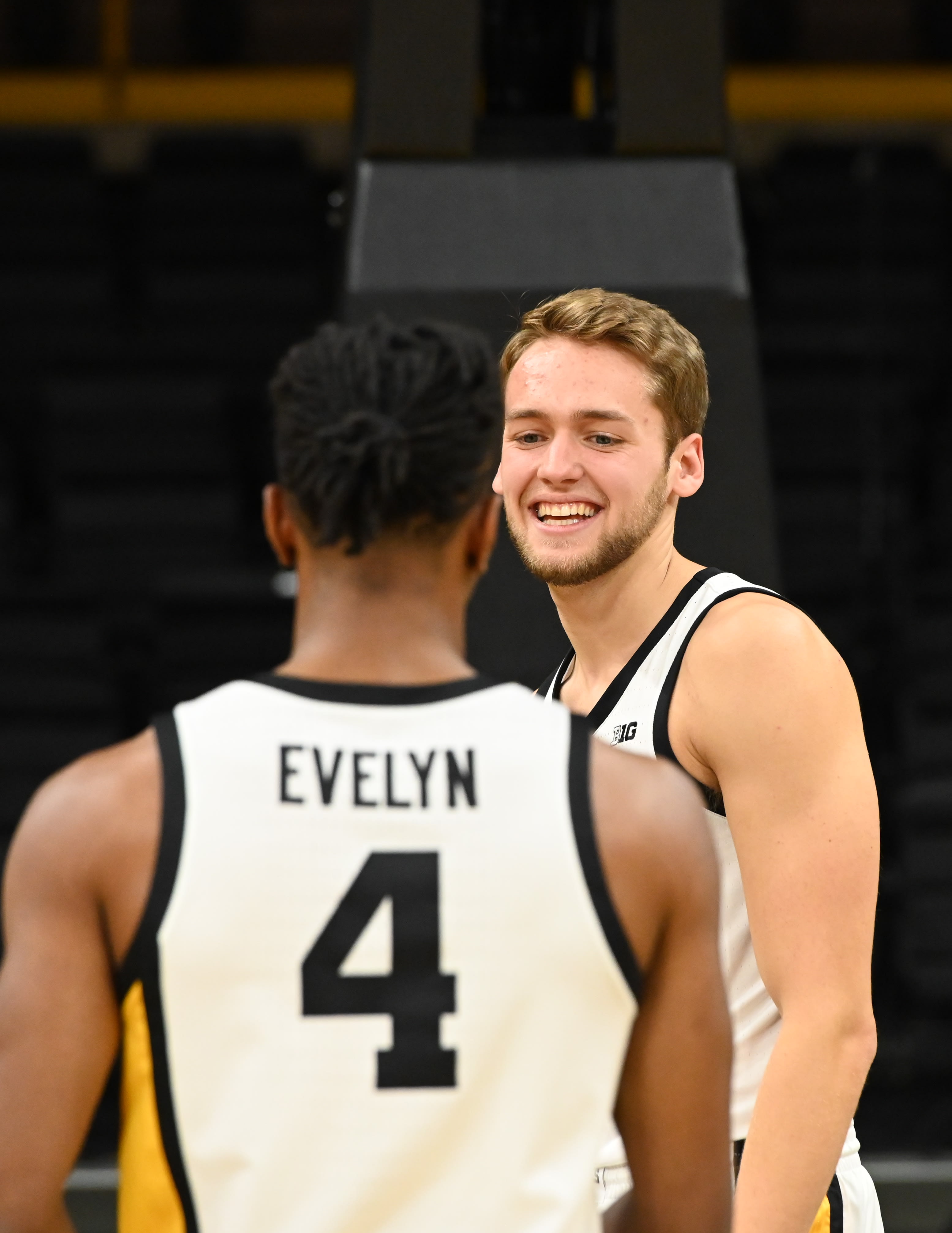
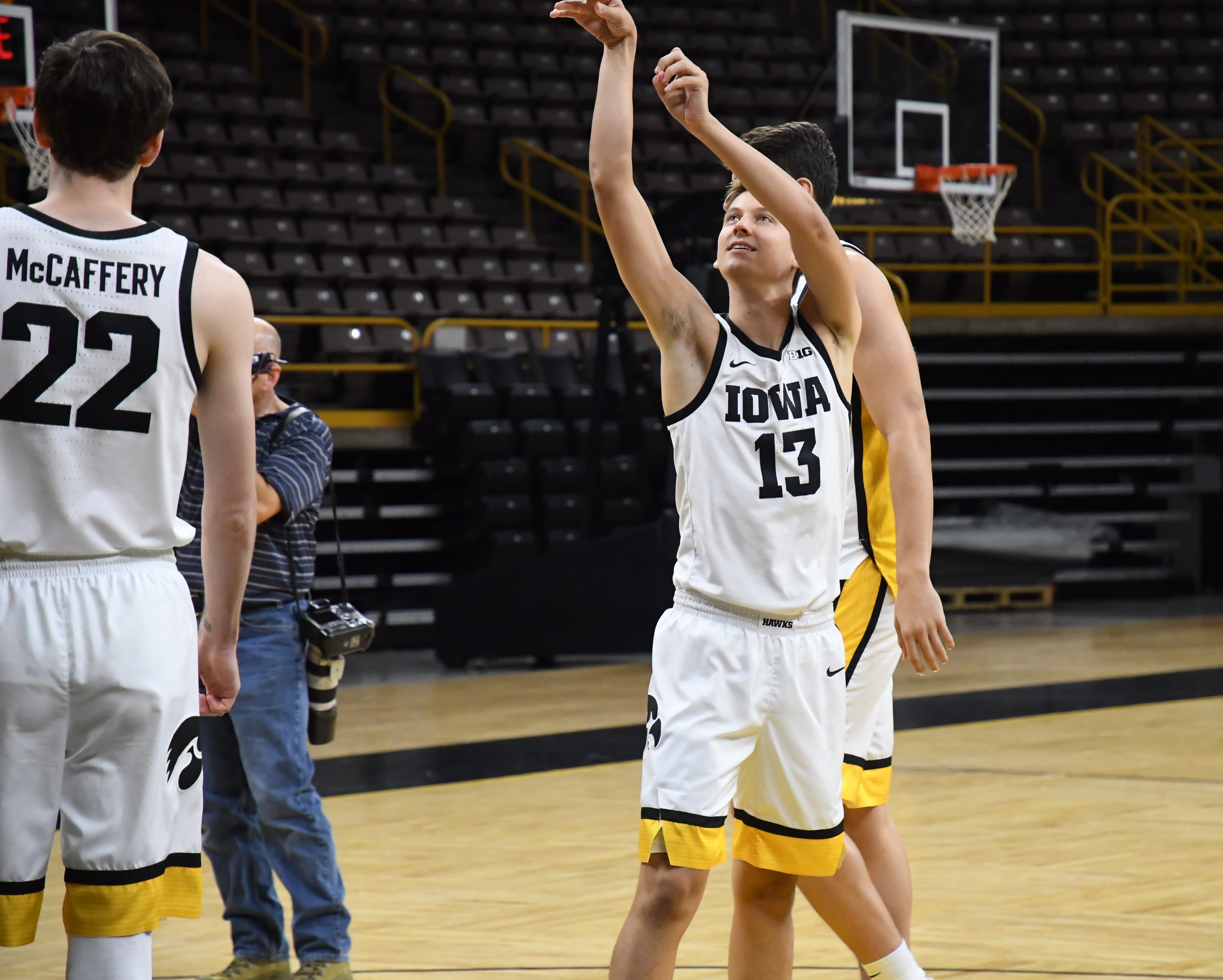
I always hated the font on the last jerseys.
Looks promising. Hopefully nascar font
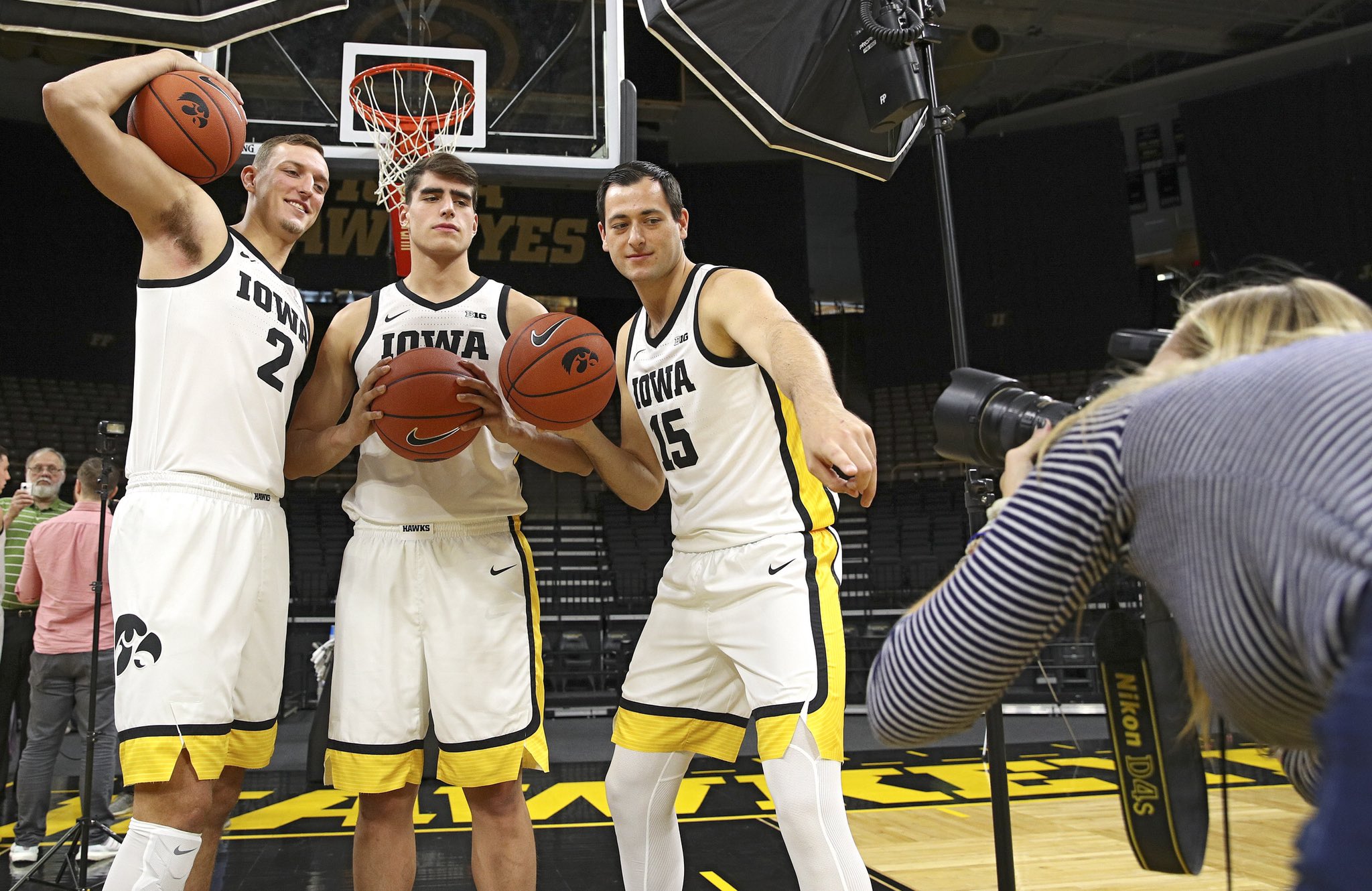
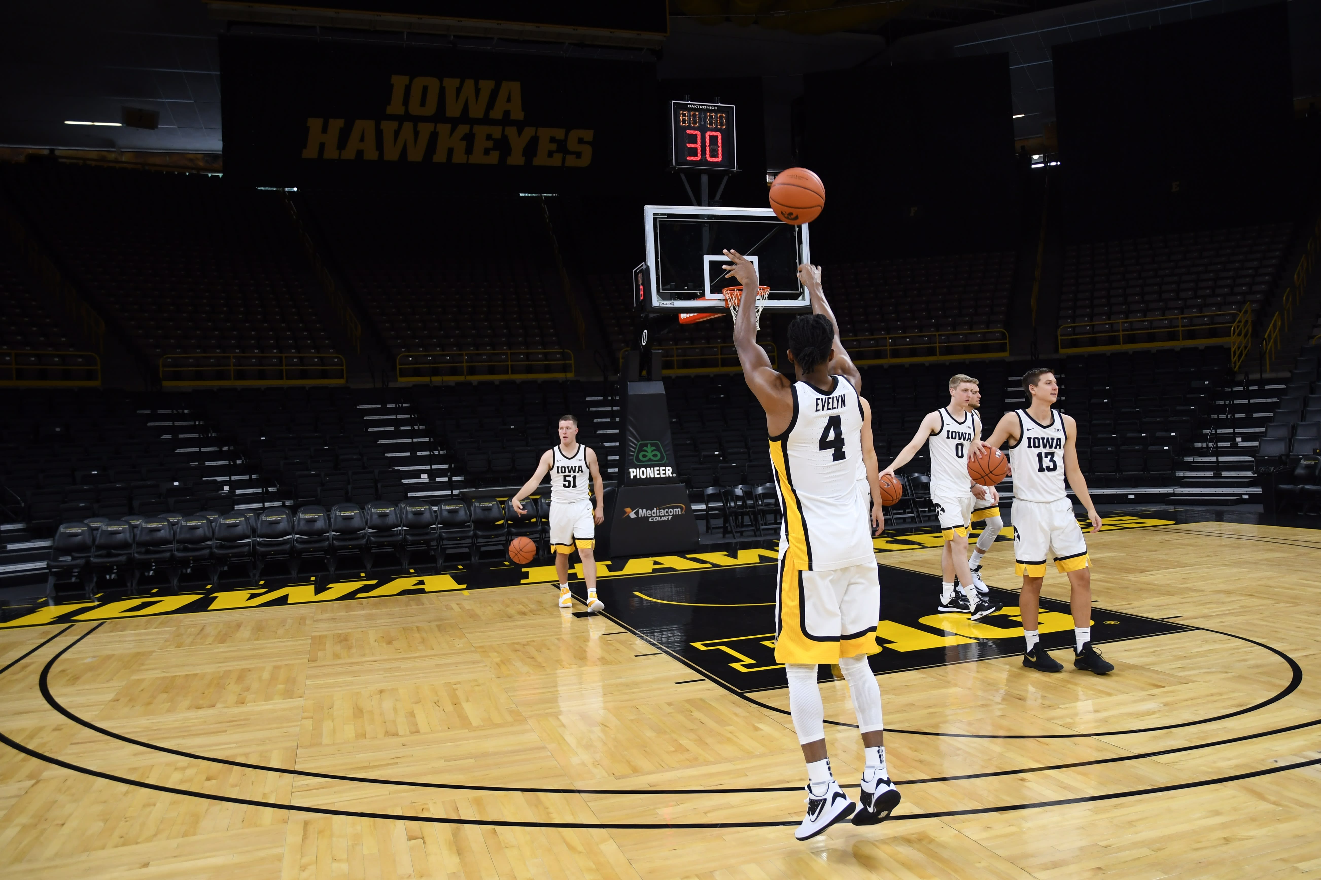
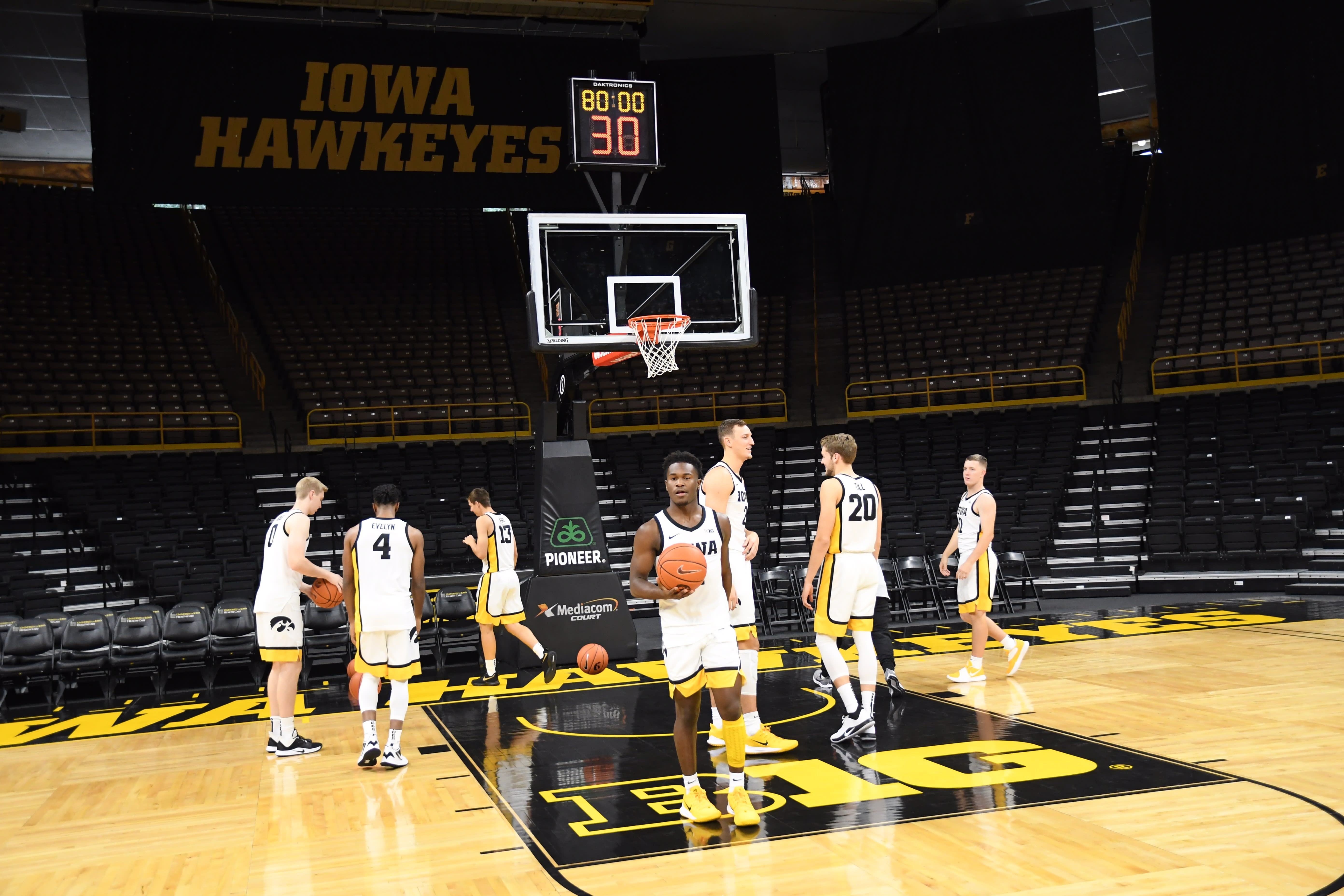
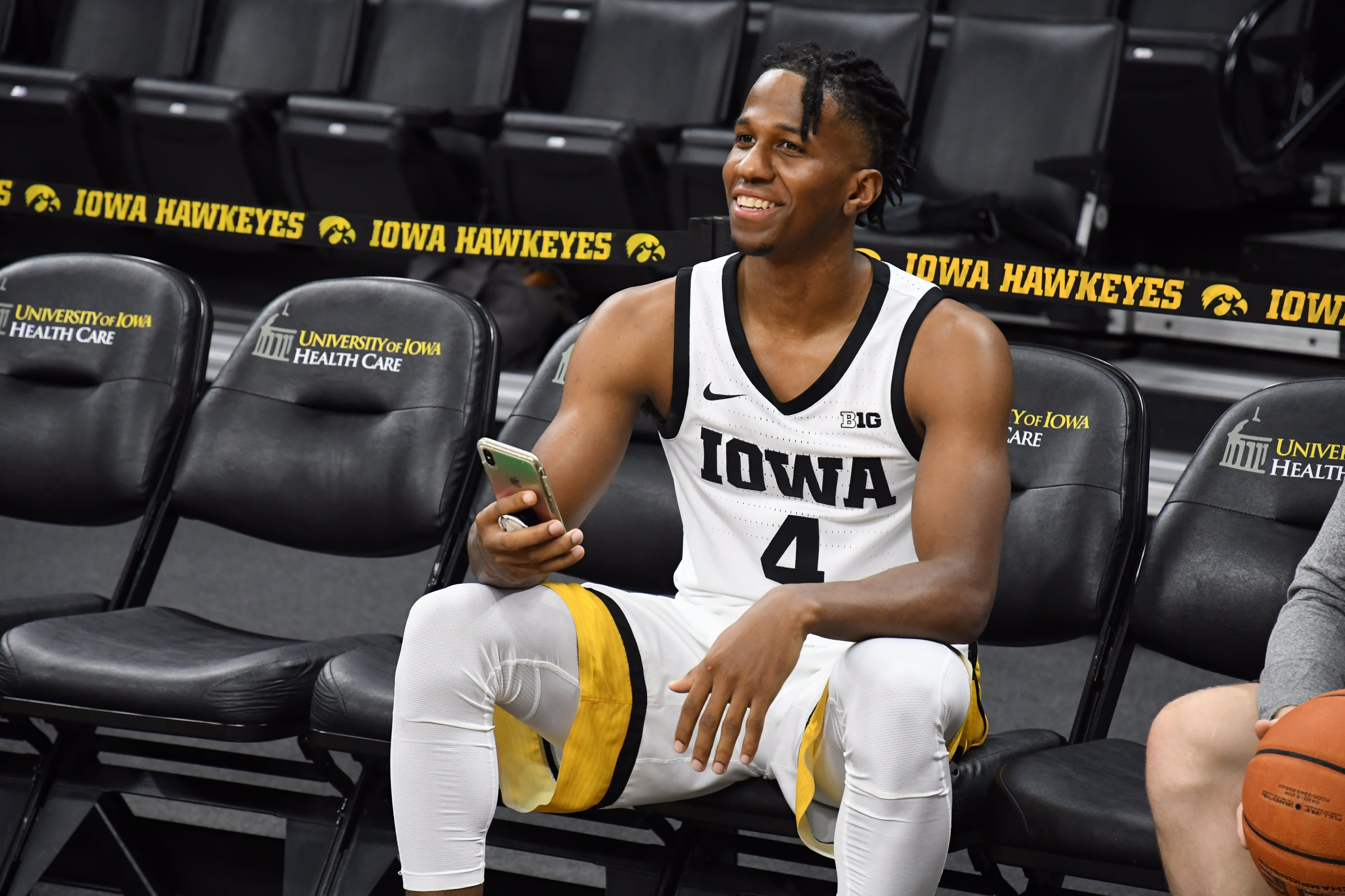
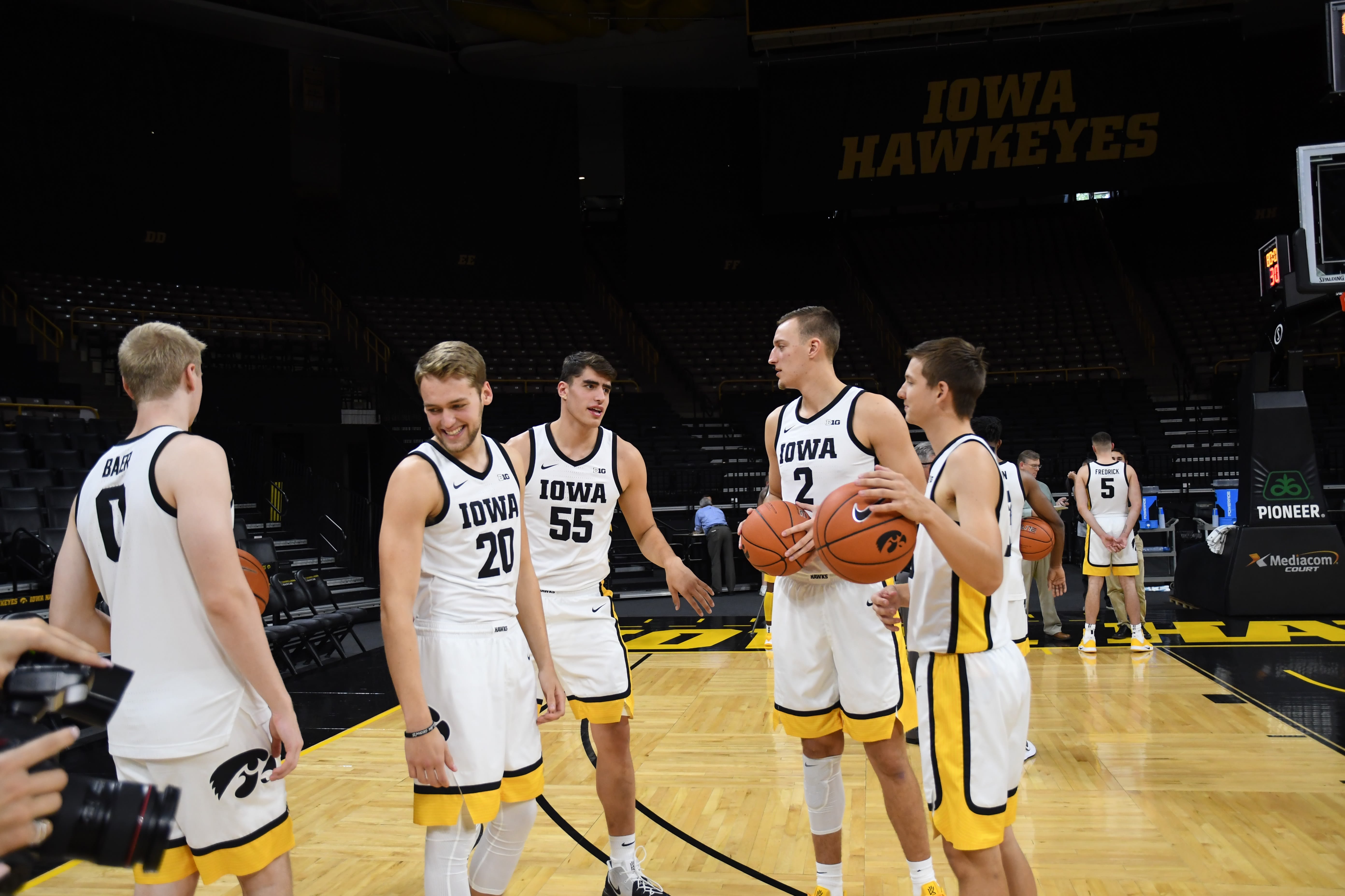
Not sure about that huge yellow stripe down sides, but guess we'll have to see....
i wish they would have sneak peaked the black ones!
Love the UI trying to get people excited but not actually showing you anything. Bait and switch coming
Love the UI trying to get people excited but not actually showing you anything. Bait and switch coming
Yeah that was pretty lame, show us what all three jerseys look like.
You realize that media day is today, right?
And how pumped people were when we wore the grays with no warning last year?
And how pumped people were when we wore the grays with no warning last year?
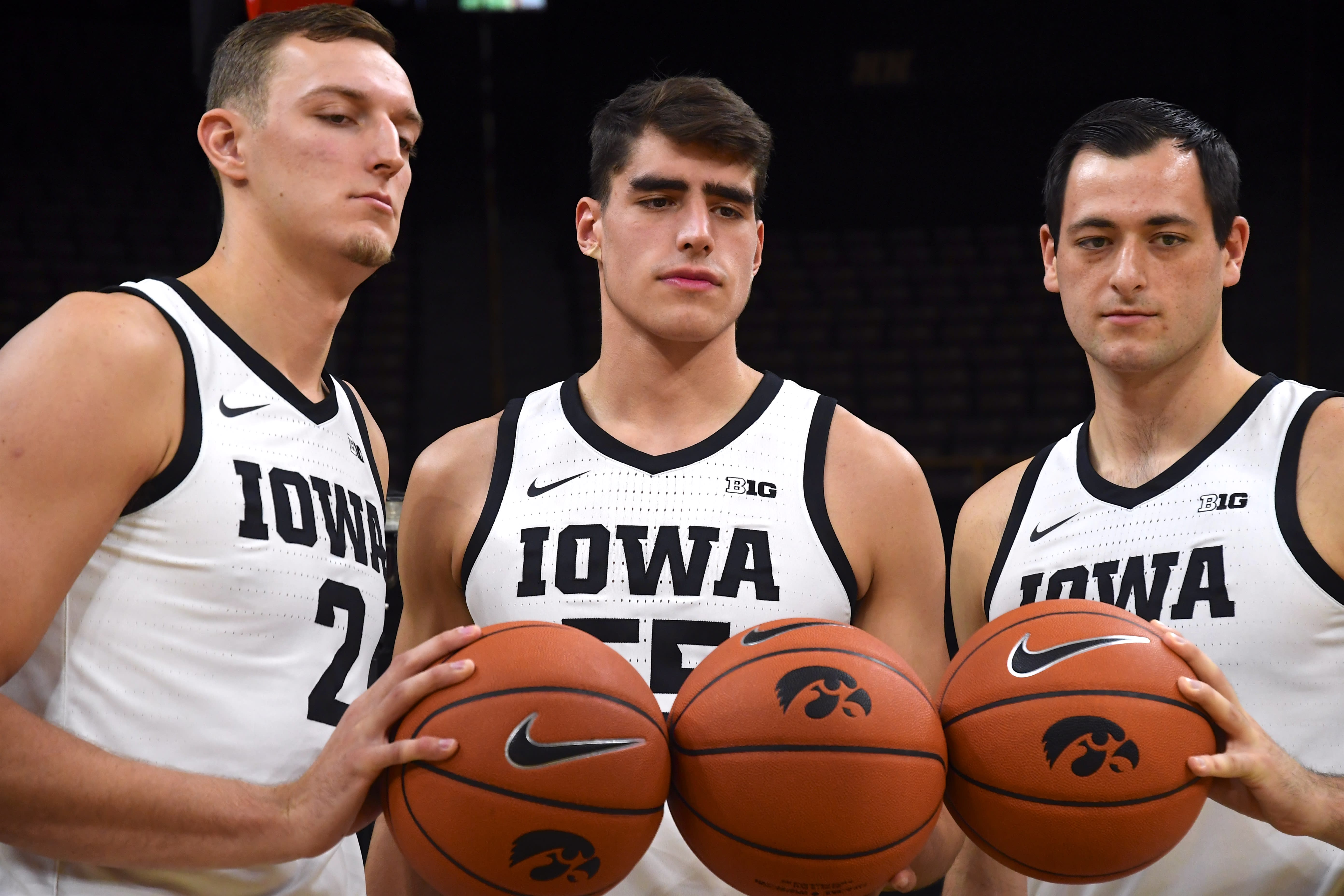
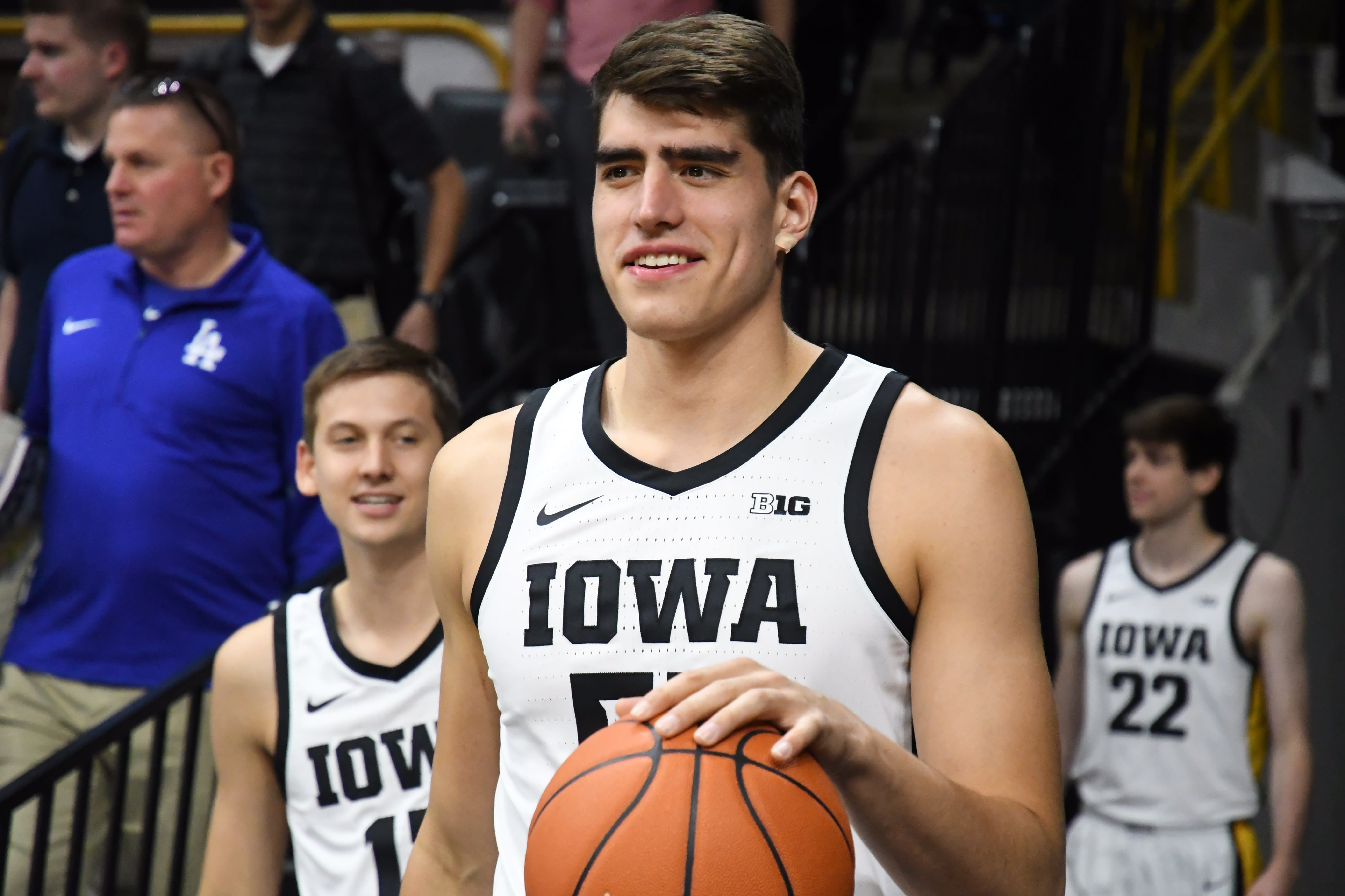
Good font...check
No weird designs...check
Yellow used boldly and not as an accent...check
No weird designs...check
Yellow used boldly and not as an accent...check
Home jerseys should be gold.
Wish they’d go away from white jerseys.
Wish they’d go away from white jerseys.
While I never lose sleep on the topic ... has always sort of baffled me why Nike can't create a cool basketball jersey design. We have a great color scheme ... yet our final product is usually pretty blah ... Not saying we need sparkles ... but come on ... you are Nike ...(Sidenote: Latest unis don't look too bad)
While I never lose sleep on the topic ... has always sort of baffled me why Nike can't create a cool basketball jersey design. We have a great color scheme ... yet our final product is usually pretty blah ... Not saying we need sparkles ... but come on ... you are Nike ...(Sidenote: Latest unis don't look too bad)
Agree. With the Nike logo on it, you would think Nike Corp would want something to be proud of.
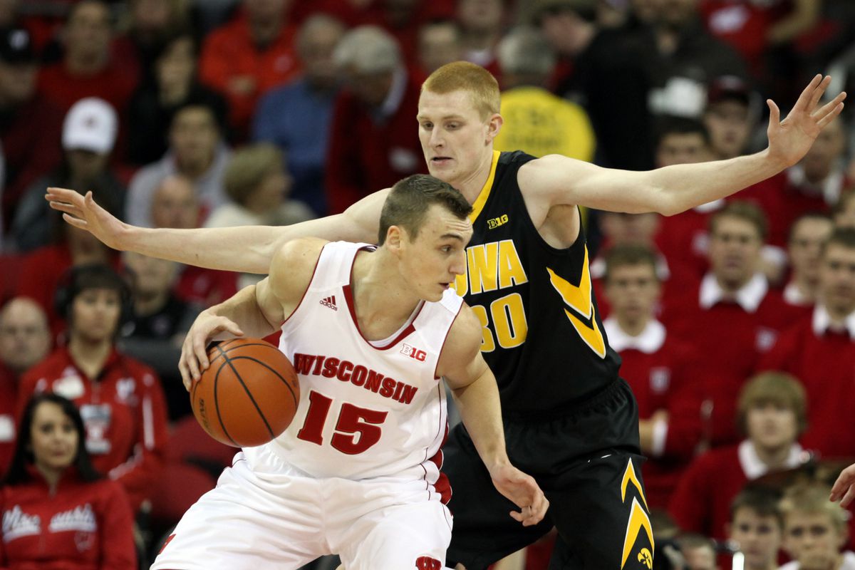
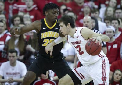
As you can see from the pics below, we hadn't changed designs in a LONG time.
* Why you needed white around "IOWA" I will never know
* Why you would fill in the "O" with white I will never know. It just did not look good on TV or in pictures.
* The arrows down the side appeared to be a desperate design attempt at something other than a simple stripe

Love the tops/clean font. But we're doing the weird thing where the stripe is only on one side of the uniform. I think that looks a little hokey.
Doesn't another team have (or had) the exact same desgin where theres one side stripe and a thick stripe at the bottom of the pants? I'm sure I've seen it before but cant remember where.
Doesn't another team have (or had) the exact same desgin where theres one side stripe and a thick stripe at the bottom of the pants? I'm sure I've seen it before but cant remember where.
Yeah, the font alone on these jerseys = horrible ... Black and gold ... man, so many options ...Agree. With the Nike logo on it, you would think Nike Corp would want something to be proud of.
As you can see from the pics below, we hadn't changed designs in a LONG time.
* Why you needed white around "IOWA" I will never know
* Why you would fill in the "O" with white I will never know. It just did not look good on TV or in pictures.
* The arrows down the side appeared to be a desperate design attempt at something other than a simple stripe


I was very much done with the up and down arrows so any change on that front is welcome. I have always thought our shorts underutilized the best logo in sports so excited to see an fresh look. Hoping for the best
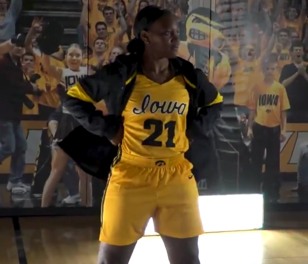
Looks like the women have new gold alts with the script "Iowa" from the 80's.
here are the ladies' gold jerseys.
Note the cursive "Iowa."
Pretty damn sweet, imo.
Watch:
Men’s unis- 6/10
Women’s unis- 10/10
Women’s unis- 10/10
New uniforms....Meh. Who designs these? With similar colors, VCU seems to have cool unis most years..

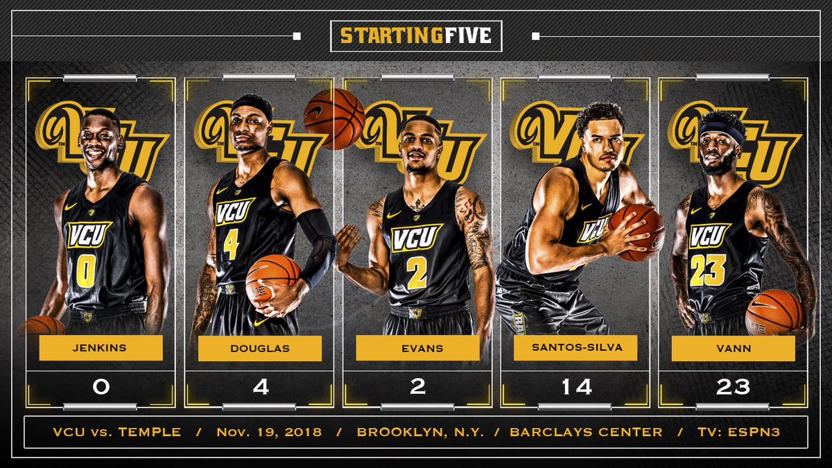


Men’s is a big upgrade. Women’s knocked it out of the park though!
New uniforms....Meh. Who designs these? With similar colors, VCU seems to have cool unis most years..


Those are not as sharp as Iowa's new ones. Those VCU ones are standard, you see plenty like that.
Like the girls' unis better. The new boys' unis look like the Pacers.
Are the Pacers still a thing?
Are the Pacers still a thing?
here are the ladies' gold jerseys.
Note the cursive "Iowa."
Pretty damn sweet, imo.
Watch:
I like the gold but I'm afraid the younger fans won't be able to read the cursive!
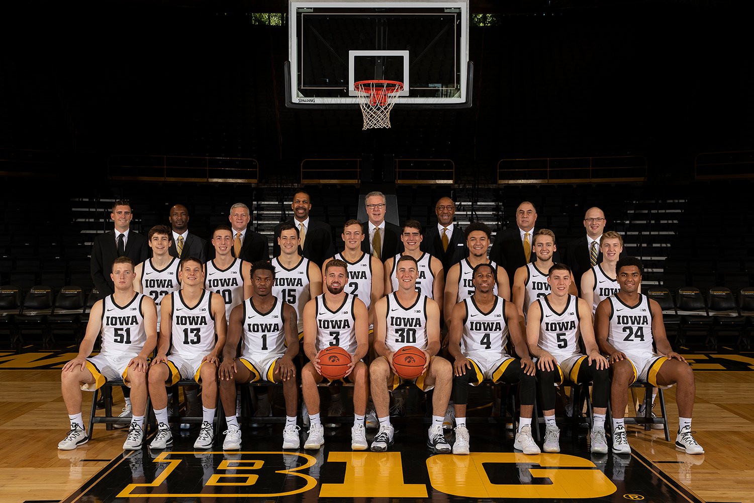
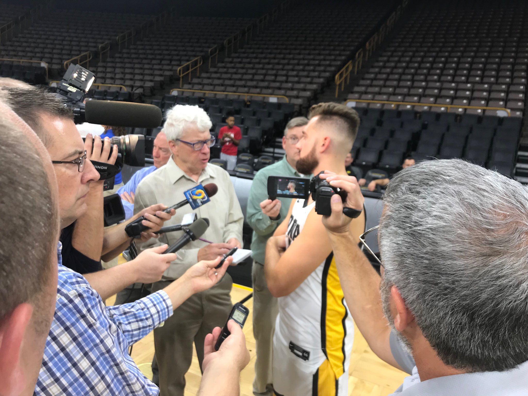
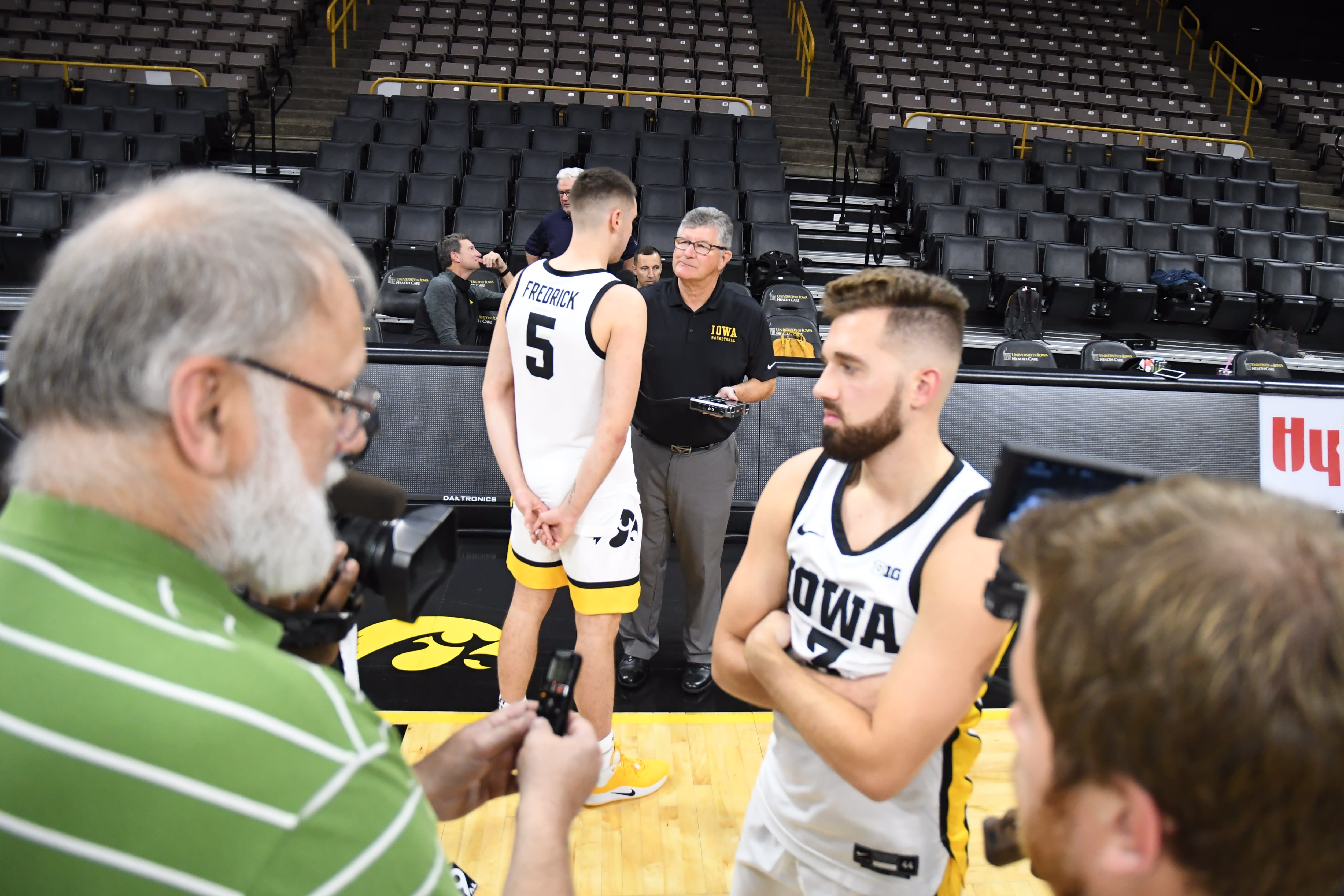
too bad, when it came to meeting w/ the press, there weren't 4 players wearing black uni's, 4 wearing gold uni's, and 4 or more (the rest) wearing the white uni's so that we could get a full look at the full uniform lineupI like the gold but I'm afraid the younger fans won't be able to read the cursive!
Like the girls' unis better. The new boys' unis look like the Pacers.
Are the Pacers still a thing?

Men's jerseys are way better than the women's. The script Iowa is great, but they tried to combine it with horrible numbers and tried to incorporate new ideas with it.
I always thought it would be cool to have fans submit jersey ideas. Then either the players vote or fans can vote on the favorite.
I think it's a great way to get fans excited
I think it's a great way to get fans excited
The women’s black ones last year were awesome. I’d like to see us wear black home and away. Could be our signature thing, like Cowboys or LSU almost always wearing white.
Can't say I'm a fan. Basically black and white with a huge yellow stripe. Meh. And why can't they use GOLD instead of highlighter yellow? The school colors are black and GOLD, after all.
I'd be good with the old school cursive "Iowa" script that many are a fan of.
But... in my mind, just bring back the design below and then leave it alone. IMO these are perfect:

I'd be good with the old school cursive "Iowa" script that many are a fan of.
But... in my mind, just bring back the design below and then leave it alone. IMO these are perfect:
Last edited:
Last edited:
Similar threads
- Replies
- 2
- Views
- 363
- Replies
- 19
- Views
- 1K
- Replies
- 1
- Views
- 477
ADVERTISEMENT
ADVERTISEMENT


