
Have you guys been watching Iowa baseball lately? They have so many cool uniform combinations its unreal. See examples at the end of this thread.
Iowa men's basketball?
* First off, look at our black jersey top (see image below). The "O" is filled in with white; I always thought that looked cheap. .
* And there are weird arrows pointing up and down along the side. Those arrows look like a desperate attempt to be creative.
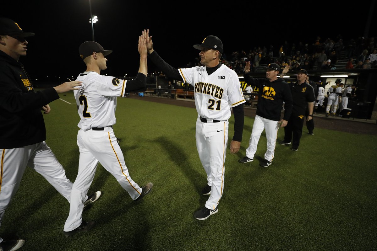
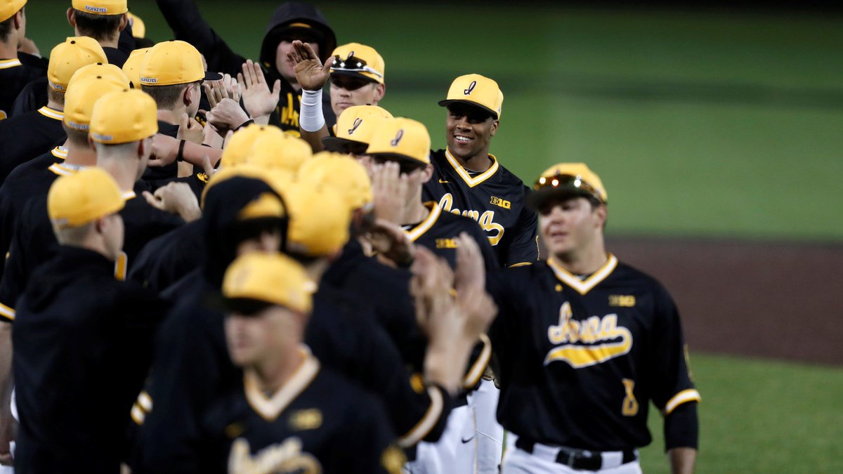
Iowa baseball?
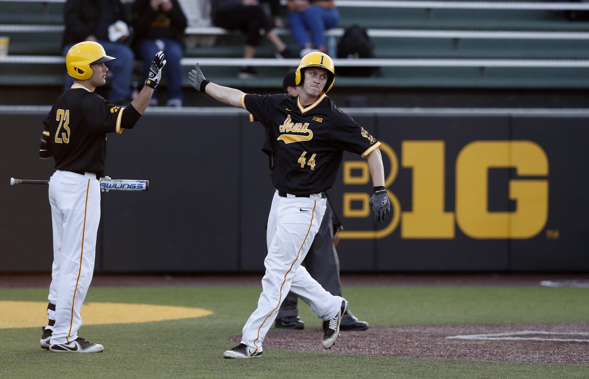
* You will see "IOWA" in cursive; sometimes it is block lettering, but with different fonts!!!
* There are cool logo's on the sleeves; on one side is the Tigerhawk; on the other is Herky standing, up to bat.
* The letters (see images below) on the black jersey are not cheaply filled in with white.
* There is simple classic striping down the sides of the uniform. No desperate looks on this uniform at all.

How does a non revenue sport (baseball) completely out style (in terms of uniforms) a revenue sport like men's basketball?
Here are some examples of the classic look of the baseball uniform. No weird arrows; just simple black and gold striping. And note: the "A," or any letter for that matter, is never cheaply filled in with white (or any color).
CLICK ON THE IMAGE FOR A LARGER VIEW
Iowa men's basketball?
* First off, look at our black jersey top (see image below). The "O" is filled in with white; I always thought that looked cheap. .
* And there are weird arrows pointing up and down along the side. Those arrows look like a desperate attempt to be creative.
Iowa baseball?
* You will see "IOWA" in cursive; sometimes it is block lettering, but with different fonts!!!
* There are cool logo's on the sleeves; on one side is the Tigerhawk; on the other is Herky standing, up to bat.
* The letters (see images below) on the black jersey are not cheaply filled in with white.
* There is simple classic striping down the sides of the uniform. No desperate looks on this uniform at all.
How does a non revenue sport (baseball) completely out style (in terms of uniforms) a revenue sport like men's basketball?
Here are some examples of the classic look of the baseball uniform. No weird arrows; just simple black and gold striping. And note: the "A," or any letter for that matter, is never cheaply filled in with white (or any color).
CLICK ON THE IMAGE FOR A LARGER VIEW
Last edited: