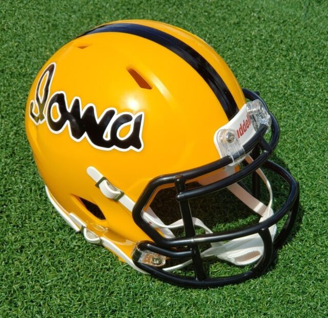

I love that there is no white in the jersey. Just black and gold. Very cool.The just posted them on instagram
I assume these will be same black pants as before. I like the look a lot — just wish the gold stripe wasn’t as wide. (Or perhaps removed altogether, and replaced with a gold Tiger Hawk on the hip.)
I’ve said before that we should have gold pants, black pants, and white pants, along with a black jersey, a white jersey, and a gold jersey, that all keep the same general “look.” Then, pretty much any jersey could be worn with any set of pants, and we would still be on-brand, and still look like “Iowa.” It seems like that’s the direction we’ve headed.