
Bringing back the script gold against DePaul. Hopefully these become the new Home uniforms.
Colleges
- American Athletic
- Atlantic Coast
- Big 12
- Big East
- Big Ten
- Colonial
- Conference USA
- Independents (FBS)
- Junior College
- Mountain West
- Northeast
- Pac-12
- Patriot League
- Pioneer League
- Southeastern
- Sun Belt
- Army
- Charlotte
- East Carolina
- Florida Atlantic
- Memphis
- Navy
- North Texas
- Rice
- South Florida
- Temple
- Tulane
- Tulsa
- UAB
- UTSA
- Boston College
- California
- Clemson
- Duke
- Florida State
- Georgia Tech
- Louisville
- Miami (FL)
- North Carolina
- North Carolina State
- Pittsburgh
- Southern Methodist
- Stanford
- Syracuse
- Virginia
- Virginia Tech
- Wake Forest
- Arizona
- Arizona State
- Baylor
- Brigham Young
- Cincinnati
- Colorado
- Houston
- Iowa State
- Kansas
- Kansas State
- Oklahoma State
- TCU
- Texas Tech
- UCF
- Utah
- West Virginia
- Illinois
- Indiana
- Iowa
- Maryland
- Michigan
- Michigan State
- Minnesota
- Nebraska
- Northwestern
- Ohio State
- Oregon
- Penn State
- Purdue
- Rutgers
- UCLA
- USC
- Washington
- Wisconsin
High Schools
- Illinois HS Sports
- Indiana HS Sports
- Iowa HS Sports
- Kansas HS Sports
- Michigan HS Sports
- Minnesota HS Sports
- Missouri HS Sports
- Nebraska HS Sports
- Oklahoma HS Sports
- Texas HS Hoops
- Texas HS Sports
- Wisconsin HS Sports
- Cincinnati HS Sports
- Delaware
- Maryland HS Sports
- New Jersey HS Hoops
- New Jersey HS Sports
- NYC HS Hoops
- Ohio HS Sports
- Pennsylvania HS Sports
- Virginia HS Sports
- West Virginia HS Sports
ADVERTISEMENT
You are using an out of date browser. It may not display this or other websites correctly.
You should upgrade or use an alternative browser.
You should upgrade or use an alternative browser.
Script Gold uniforms
- Thread starter Swimhawk24
- Start date

Really love the new uniforms. Going with the script would would be awesome. Visions of Steve Carfino
Pic or gtfo
Click the play button in the post above yours.
The white ones should have had the script as well. I am not a fan of the new white ones.Bringing back the script gold against DePaul. Hopefully these become the new Home uniforms.

Agreed, I always thought they looked like the jerseys the women wear.I know, I know. But, not a fan of the script Iowa.
I don't mind the script, but for me, the jersey conversation starts and ends with these. Best Hawk jerseys ever, and IMO it's not close.

I don't mind the script, but for me, the jersey conversation starts and ends with these. Best Hawk jerseys ever, and IMO it's not close.
the new whites use pretty much this same design
I don't mind the script, but for me, the jersey conversation starts and ends with these. Best Hawk jerseys ever, and IMO it's not close.
the new whites use pretty much this same design
New white ones aren’t even close to the same design as these.
New white ones aren’t even close to the same design as these.
No they aren't.
The only problem I have is that the IOWA is just generic black lettering and seems a bit too small and off-center. Just something about it looks off.The white ones should have had the script as well. I am not a fan of the new white ones.
They should've done it the way the uniforms use to look in the mid to late '90s where the IOWA stretched almost completely across the front.
Tricky thing about the Davis era uniforms is that they were changed almost every season. Sometimes they were designed by the team.
Block iowa. Stripe down side in opposite color. I’m not saying They are replicas or anything but they were definitely going for a throwback look.
Much better than last years.The white ones should have had the script as well. I am not a fan of the new white ones.
I'm just glad the stupid side arrows are gone. No idea why we stuck with those so long
Here's what those uniforms looked like back in 1979/1980.
CLICK ON IMAGE FOR LARGER VIEW


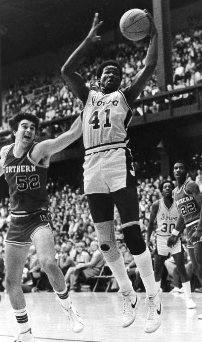


CLICK ON IMAGE FOR LARGER VIEW
Last edited:
Similar threads
- Replies
- 5
- Views
- 791
- Replies
- 49
- Views
- 4K
- Replies
- 94
- Views
- 2K
- Replies
- 2
- Views
- 368
- Replies
- 73
- Views
- 7K
ADVERTISEMENT
Latest posts
-
Who Could Be Iowa MBB's Next Commit? + Two Priority Visitors Scheduled
- Latest: WaterlooChazz
-
-
-
ADVERTISEMENT