I posted this in the Lounge...Figured I would share it here too.


Follow along with the video below to see how to install our site as a web app on your home screen.
Note: This feature may not be available in some browsers.
I love it.I posted this in the Lounge...Figured I would share it here too.
There was noneI guess I never paid enough attention to know what the previous lettering looked like.
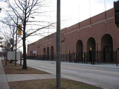
They need to change the lettering outside the East stands too. And spiff it up. That side of Kinnick looks like a prison wall. It wouldn’t take much to make it look a lot better.

I’m old. I’ve always loved the East side of Kinnick.
It’s subjective but I like it as it was designed. To me, one of the cool things about Kinnick Stadium is the old blended with the new. If you walk 360° around it, you see original architecture blended with modern. I just think it is spectacular.It’s so boring. Of course the archways and brick are cool. But, don’t you think it would look better with some stone or different colored brick added in spots?
It’s subjective but I like it as it was designed. To me, one of the cool things about Kinnick Stadium is the old blended with the new. If you walk 360° around it, you see original architecture blended with modern. I just think it is spectacular.

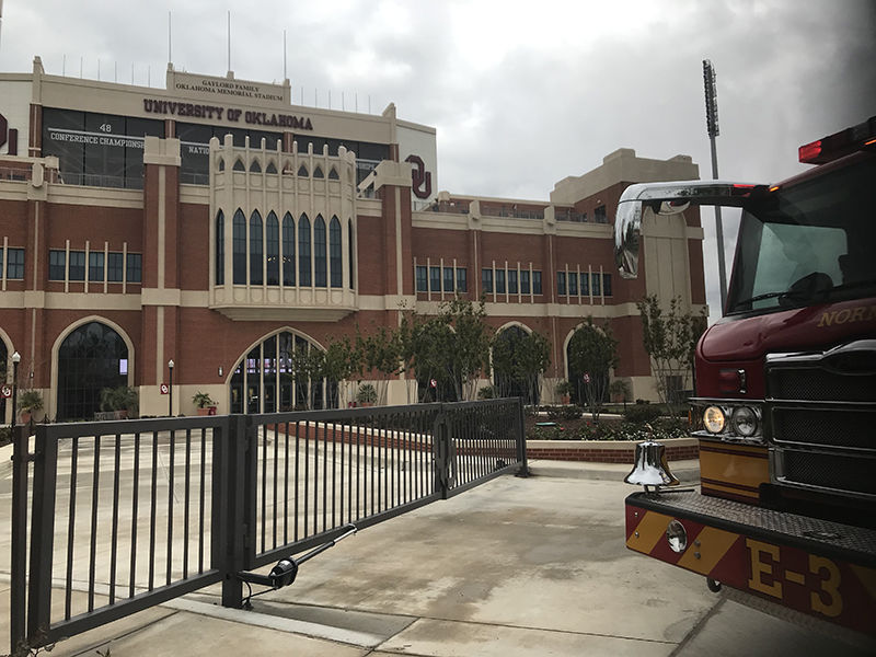
I’ve been to Norman. Kinnick is better I’m my eyes. In fact, I don’t like the interior of Oklahoma.I hear ya. I think it could use more character though. Imagine some of what Oklahoma did with their recent renovation on the east side of Kinnick.
Looks like Disney’s Magic Castle. No thank youI hear ya. I think it could use more character though. Imagine some of what Oklahoma did with their recent renovation on the east side of Kinnick.
Looks like Disney’s Magic Castle. No thank you
I hear ya. I think it could use more character though. Imagine some of what Oklahoma did with their recent renovation on the east side of Kinnick.
Couldn't agree more. The south endzone is a design fail. If the south endzone was identical to the north just imagine what that would look and sound like.now lets re-do the south endzone!
weren't we told that the south endzone could not have a steep incline because of new building rules (at that time)?Couldn't agree more. The south endzone is a design fail. If the south endzone was identical to the north just imagine what that would look and sound like.
I do remember hearing something like that but they still could of stacked to upper sections and kept the same pitch. Not sure if those building codes are still in place because the north endzone seems to break most of them.weren't we told that the south endzone could not have a steep incline because of new building rules (at that time)?
also, why they did not enclose it i will never understand
weren't we told that the south endzone could not have a steep incline because of new building rules (at that time)?
also, why they did not enclose it i will never understand
Not exactly presenting the two equally, are you?
Not sure if it's because of tuckpointing work going on or something else but the lettering on the East side has been removed.They need to change the lettering outside the East stands too. And spiff it up. That side of Kinnick looks like a prison wall. It wouldn’t take much to make it look a lot better.
Not sure if it's because of tuckpointing work going on or something else but the lettering on the East side has been removed.
Like it matters. One is nothing but bare brick. The other is brick, stone, steel and more accents than a Victorian mansion. Here's some dreary for you. Still looks pretty damn good. lol
Wonderful idea, and think how trapped the opponent would feel. Getting out my check book.Couldn't agree more. The south endzone is a design fail. If the south endzone was identical to the north just imagine what that would look and sound like.
Don't think there's an argument as to which is fancier. The main question is does it matter. Apparently it does to you. I would wager that it doesn't to most, and that many agree with me that less is more. To each his own.
Let's wager then. Which post gets more likes. Mine or yours. lol
Sure. How about $25,000,000?
Prefer BOOK ANTIQUA myself.I wish it was a Times New Roman font.
Oh, well…
Like it matters. One is nothing but bare brick. The other is brick, stone, steel and more accents than a Victorian mansion. Here's some dreary for you. Still looks pretty damn good. lol
Peanuts.
Tiger Hawk Logo outside the South End Zone should be Gold on a Black Background with the Gold Tiger Hawk back lit at night.Supposedly lights up at night too
They need to change the lettering outside the East stands too. And spiff it up. That side of Kinnick looks like a prison wall. It wouldn’t take much to make it look a lot better.
So....ANY updated pics of the North End Zone?